Last week two articles appeared in the New York Times that revealed “times are a changing”. During the Trump years, federal agencies responsible for collecting and disseminating information on environmental and other indicators that show shifts from previous “normal” or average conditions, have been restricted in what they could publish and comment upon. These restrictions have now been lifted under the Biden administration and they are quite revealing.
The first article I noticed was written by Christopher Flavelle in the NYT on 12th May on climate indicators in the US. He reviewed data from the Environmental Protection Agency’s suite of 54 indicators. The EPA has recently added 12 new indicators and several years of data to the suite. This information provides input into the US National Climate Assessment which reviews both the science and impacts of climate change. Flavelle quotes Michael Regan, the EPA Administrator, on the importance of disclosing this information and its value to policy given that climate change is happening now.
Detail on the EPA suite of indicators can be found at https://www.epa.gov/climate-indicators. EPA partners with more than 50 data contributors from within government and academic institutions in compiling the indicators. The web site shows links to a range of climate change data resources. Indicators are grouped into six categories: greenhouse gases; weather and climate; oceans; snow and ice; health and society; and ecosystems. Although some of the data is a few years old there is sufficient material to discern why the EPA is confident in saying “many of these observed changes are linked to the rising levels of carbon dioxide and other greenhouse gases in our atmosphere, caused by human activities”. What a contrast from what we were hearing less than 12 months ago from government sources in the US!
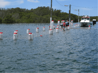
In diving into some of the data, I was struck by conclusions such as 14 out of 15 sites where permafrost is being measured, temperature has risen between 1978 and 2000. Melting permafrost is a big issue for the planet as it a source of methane, an extremely powerful greenhouse gas. My personal interest here is that I spent 3 years of my life at Schefferville in northern Quebec attached to a McGill University field station measuring permafrost (1968-70). Of course I checked out Ocean indicators and there is one that is listed as “A closer look: land loss along the Atlantic Coast”. This indictor examines 3 time slices since 1996 where land has been converted to open water, mostly tidal wetland. Alarmingly, sea floods (King Tides) are five times more frequent since the 1950s.
Another key aspect of the suite of EPA indicators are those listed under the category of Health and Society. It is apparent that this branch of the US federal government has the remit to bring together information that crosses various sectors of national interest. Here they highlight the connection between climate change and human health. It is not just a look at issues of morbidity and illnesses related to heat and cold but offers data on specific threats to health due to climate change including spread of areas affected by Lyme disease and changes to seasonal conditions related to pollen from ragweed. In all this I see a template for the new Australian Climate Services to provide information from existing data across a similar suite of indicators pertinent to changing conditions in Australia, building on already useful data collected by the former Dept. of Environment, BoM, ABS, and other institutions.
The second article, which also appeared on 12th May in the NYT, was by Henry Fountain and Jason Kao. The title “There’s a New Definition of ‘Normal’ for Weather” summarises recent work by the US agency NOAA, the source of some of the data in the EPA list. NOAA has issued what may be seen as a new set of “climate normals” for the USA. For both temperature and rainfall there is a display of changes over the last century into this century of 30-year records compared to the 20th century average set between 1931-1960. It is apparent that we are “seeing the fingerprints of climate change in the new normals” in the warming in almost every place in the US. There have been significant shifts in distribution of precipitation. The article makes the point that changing temperature record, in particular, is being attributed to emissions from heat-trapping gases over more than a century.
For those of us engrossed in climate change debates since the 1980s, it is heartening to see how a political shift in the US can give rise to the release and commentary on long collected data that reinforces the other contributions by climate scientists to our understanding of the new climate era we are now plunging into.
Bruce Thom
Words by Prof Bruce Thom. Please respect the author’s thoughts and reference appropriately: (c) ACS, 2021. For correspondence about this blog post please email austcoastsoc@gmail.com
#190

